Bunad Magasinet - Bringing Tradition Online
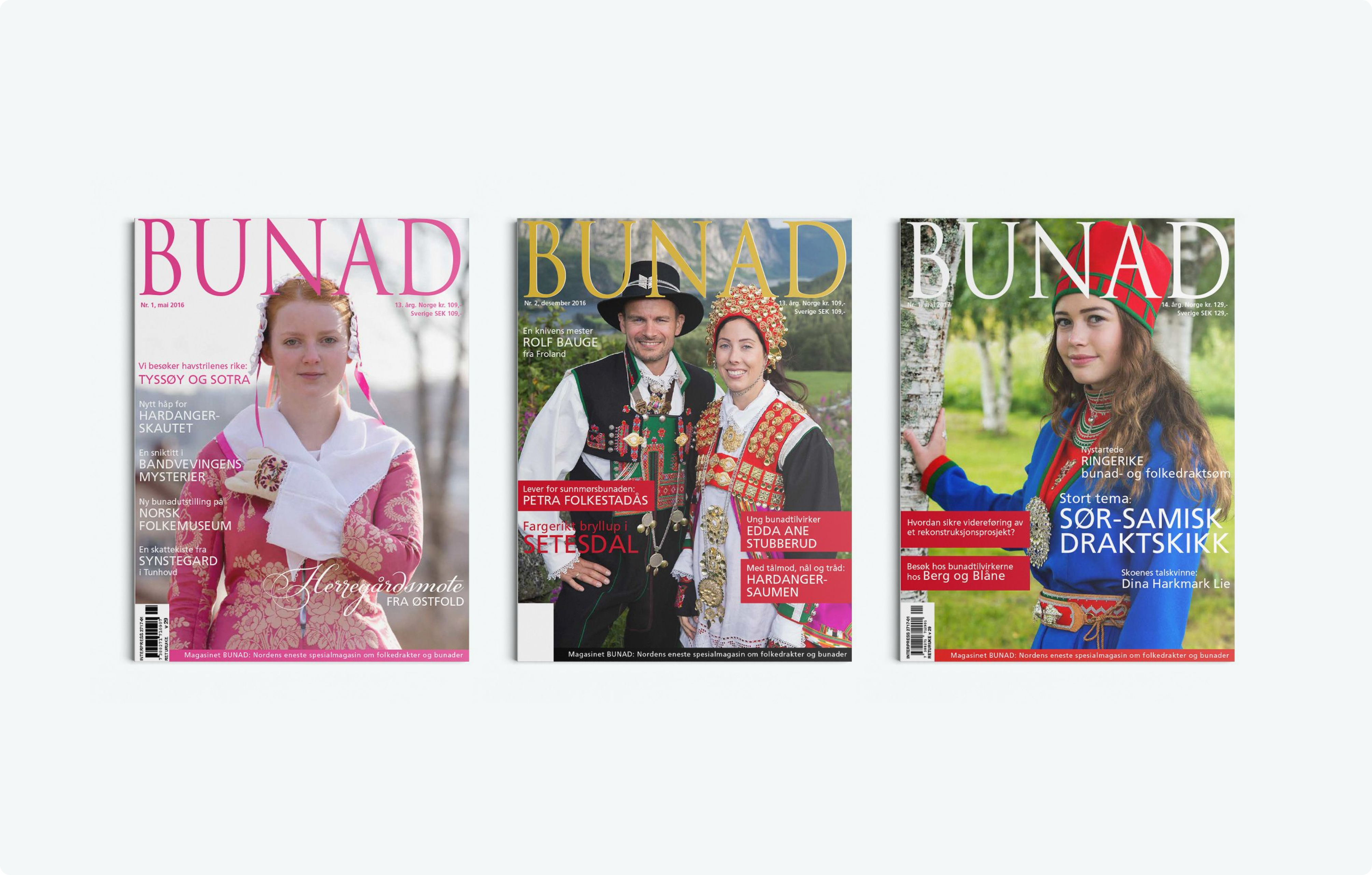
Bunad Magasin, a historic Norwegian magazine dedicated to traditional costumes, sought to transition from print to digital while preserving its cultural heritage. Snowball played a crucial role in digitizing the magazine’s entire archive, creating an e-commerce platform, and launching a subscription service. This digital transformation enabled the magazine to reach a wider audience, engage its readers more effectively, and ensure the legacy of Norwegian heritage lives on in the modern world.
Client
Bunad Magasin – A Norwegian magazine focused on the preservation of traditional costumes (bunads), offering in-depth features and expert knowledge on Norway’s cultural heritage, now transitioning to a digital-first format.
Challenge
Bunad Magasin, originally a small print publication, sought to transition into the digital age while maintaining its traditional values. The challenge was to move the entire archive of content from print to a digital format, design a new website that supports e-commerce and subscriptions, and create a seamless digital experience for their readers.
Outcome
Bunad Magasin successfully launched as a fully digital magazine, with its entire archive digitized and organized for easy access. Snowball developed an e-commerce platform and integrated subscription options, enabling the magazine to expand its reach and engage a wider audience. The transition to digital has preserved the magazine’s legacy while offering a modern, user-friendly experience for its readers.
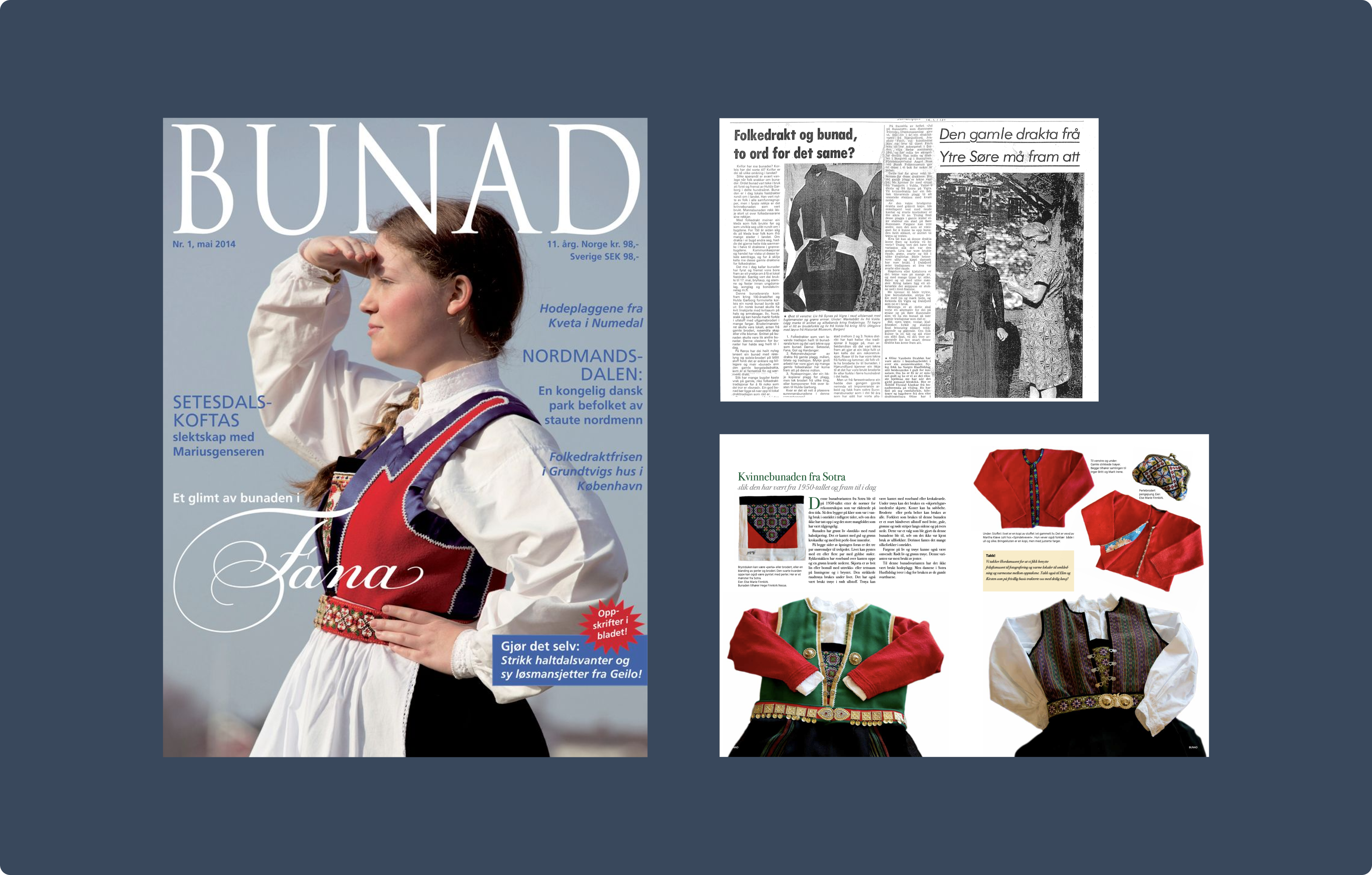
Snowball digitized Bunad Magasin’s archive to preserve and share Norwegian heritage.
Snowball’s first step was to digitize Bunad Magasin’s entire archive. This involved scanning and organizing years of print content, making it easily accessible to readers online. By transitioning from print to digital, the magazine was able to expand its reach, offering readers the ability to browse through past issues and explore detailed articles about Norwegian culture and bunads. This digital archive is now a key part of the magazine’s offering, keeping traditional knowledge alive and easily accessible.
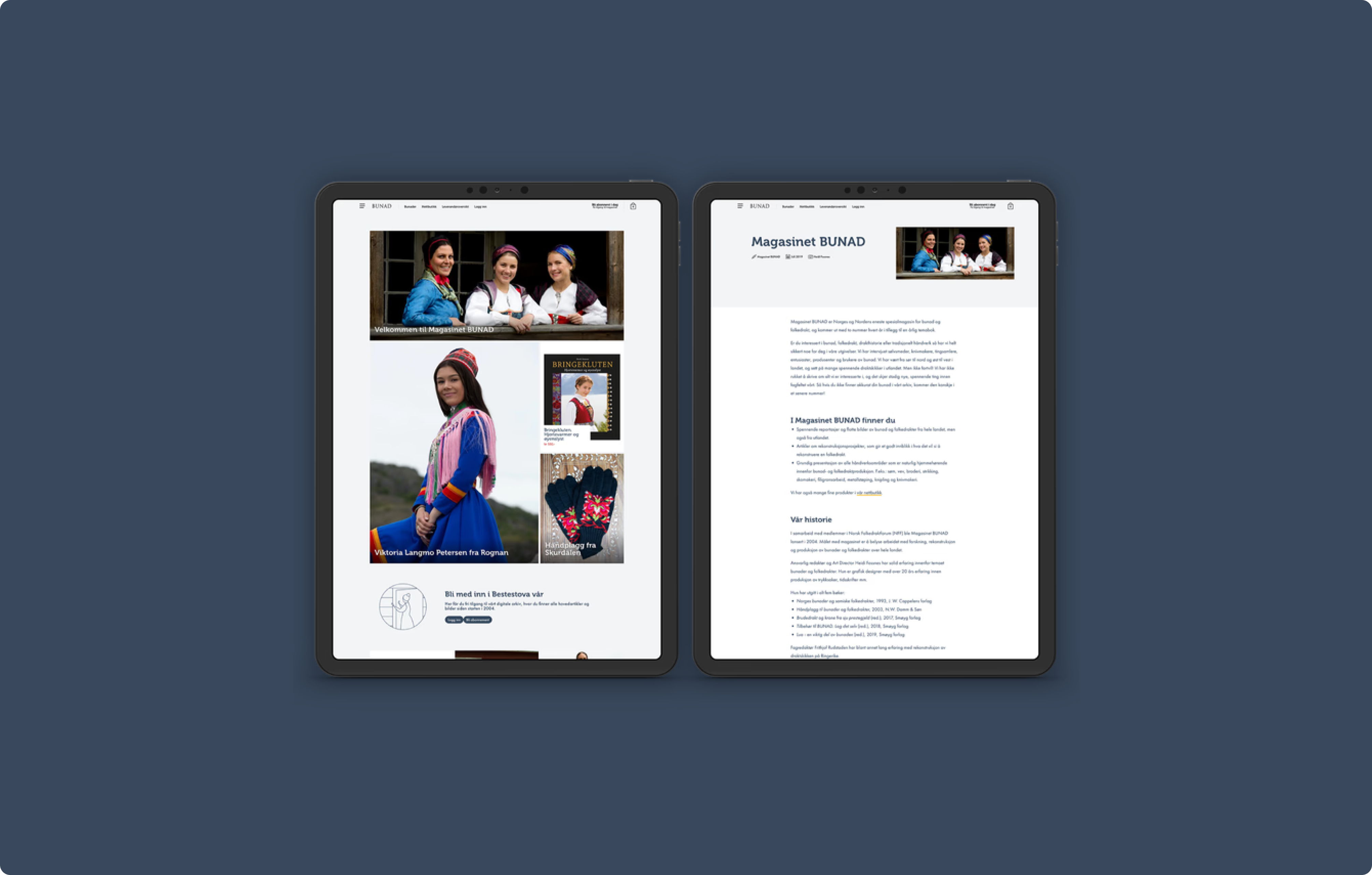
Snowball designed and developed Bunad Magasin’s modern website and e-commerce platform.
Snowball designed a modern, user-friendly website that reflects the magazine’s traditional roots while offering an enhanced digital experience. The website serves as the hub for Bunad Magasin’s content, providing easy access to articles, archives, and digital subscriptions. Additionally, we developed an integrated e-commerce platform, allowing readers to purchase individual issues and subscriptions directly. This seamless integration of content and commerce improved user experience and positioned Bunad Magasin for growth in the digital age.
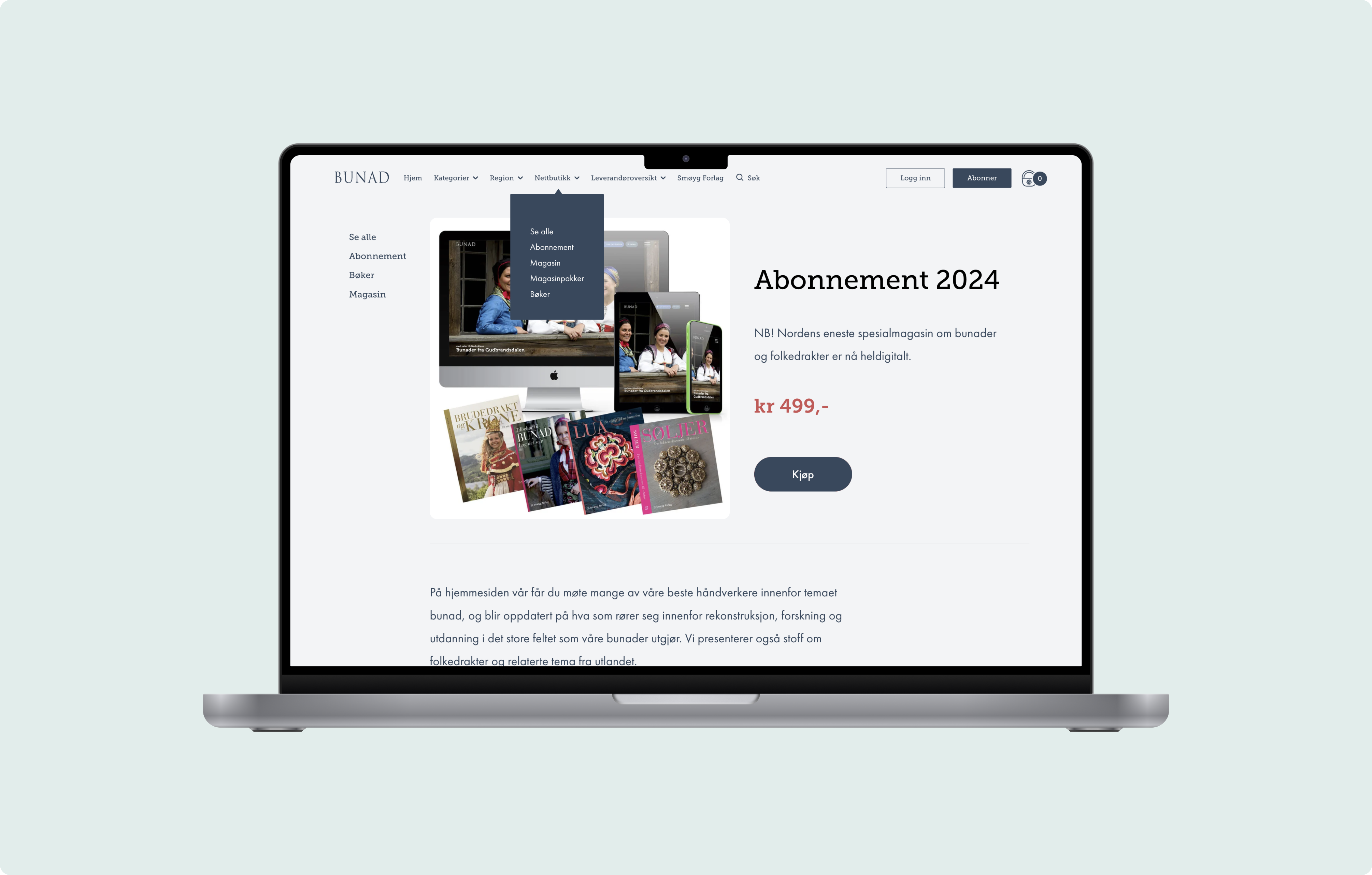
Snowball introduced a subscription model to drive engagement and revenue.
The implementation of a subscription model was a pivotal part of Bunad Magasin’s digital transformation. By offering flexible subscription options, Snowball made it easier for readers to engage with the magazine regularly and gain access to exclusive content. This model not only created a new revenue stream for the magazine but also strengthened the connection between Bunad Magasin and its loyal readership. The subscription service now forms the backbone of their digital strategy, supporting long-term growth and deeper reader engagement.


