Farstad&Co. - Reviving a Historic Coffee Brand
Farstad&Co. is a modern relaunch of a beloved family coffee brand, seamlessly blending heritage with contemporary design and commerce. Snowball led the creation of a comprehensive brand experience, from designing the physical store and its interior to crafting a user-friendly e-commerce platform and subscription concept. With visually striking coffee packaging and strategic marketing content, we helped Farstad&Co. honor its legacy while connecting with a new generation of coffee lovers.
Client
Farstad&Co. – A family-owned coffee brand reimagined for modern audiences, with a focus on quality, heritage, and creating a seamless experience across its physical store, e-commerce platform, and subscription services.
Challenge
To relaunch a historic coffee brand with a comprehensive and modern approach. This included designing the physical café and everything within it, developing and designing a seamless website and e-commerce platform, creating a subscription concept, and producing marketing materials that resonated with both loyal customers and a new generation of coffee enthusiasts.
Outcome
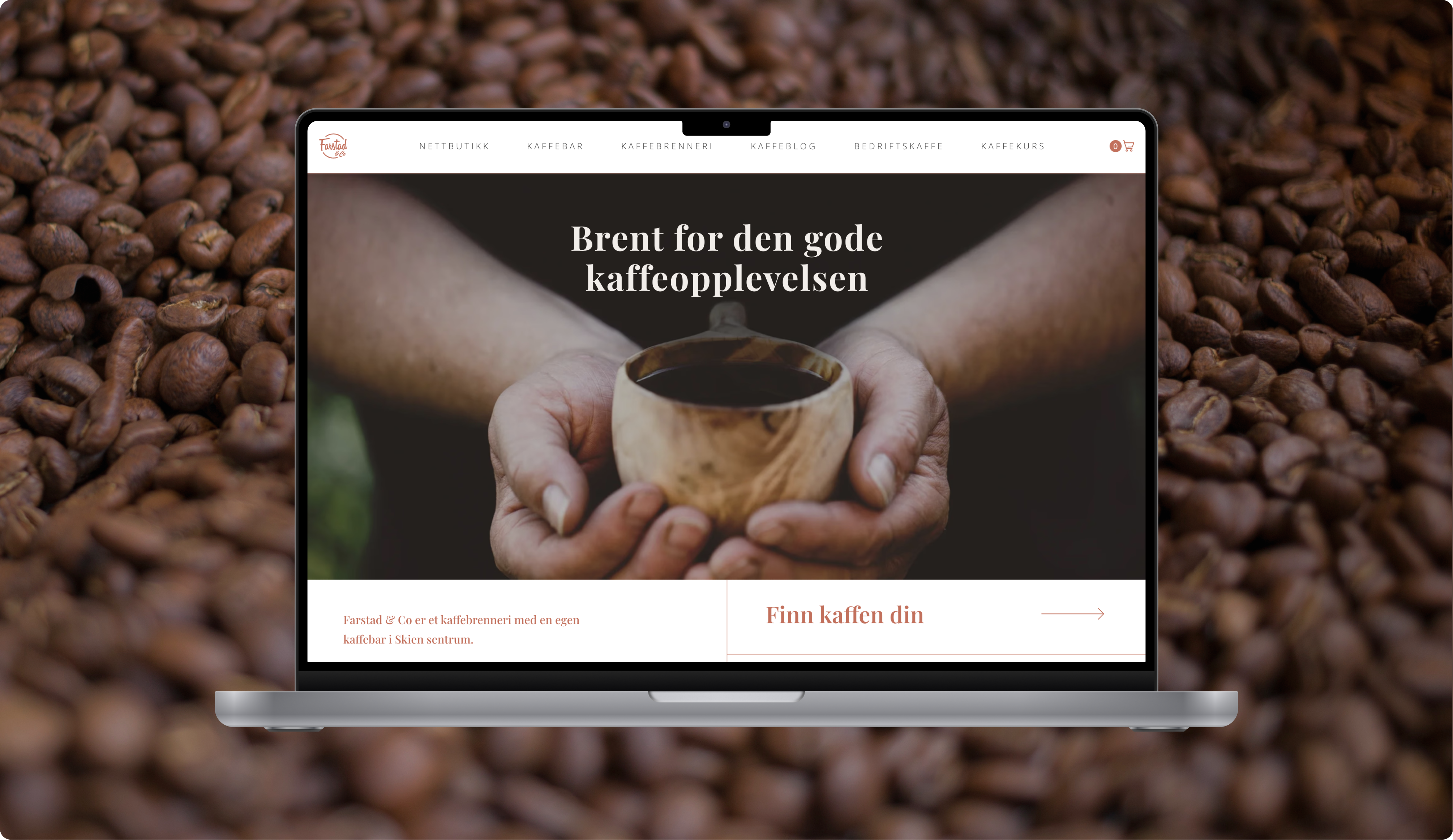
Farstad&Co. emerged as a fully revitalized brand, blending tradition with innovation. Snowball designed the physical café, developed a seamless website with an integrated e-commerce platform, and created an engaging subscription concept. Every touchpoint of the brand was thoughtfully connected, from the website to the café experience. The launch was supported by visually striking coffee packaging, targeted marketing content, and a cohesive identity that successfully reintroduced the brand to its community.
Snowball created a seamless blend of physical and digital for Farstad & Co.
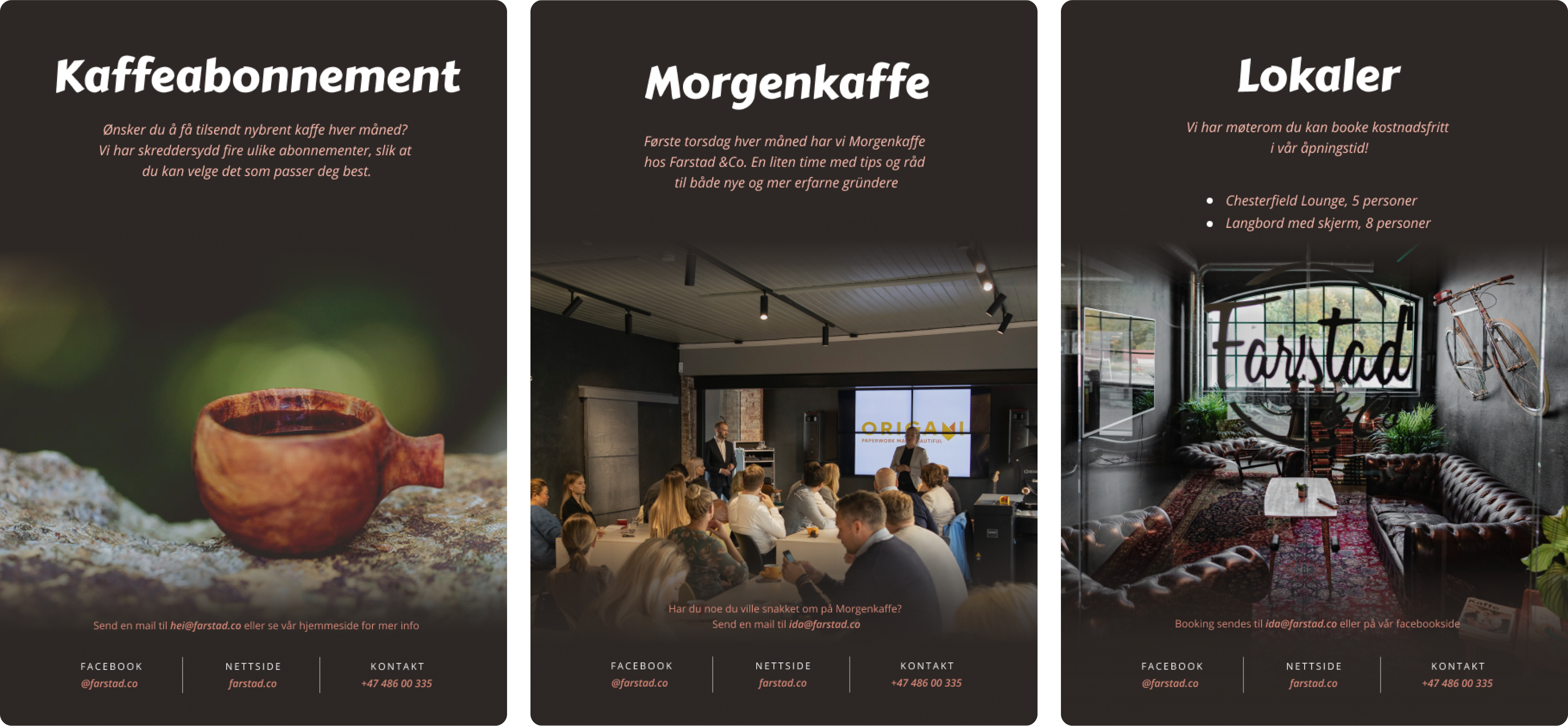
From concept to execution, Snowball crafted a holistic experience for Farstad&Co. that honoured its heritage while appealing to modern coffee enthusiasts. We designed the physical store, including its interior elements, to reflect the brand’s storied legacy. Simultaneously, we developed a robust e-commerce platform that offered both individual purchases and an innovative subscription concept. By aligning every detail—from packaging to marketing content—we ensured Farstad&Co. delivered a consistent, memorable experience across all touchpoints.
Snowball designed a brand that captures tradition with a modern twist.
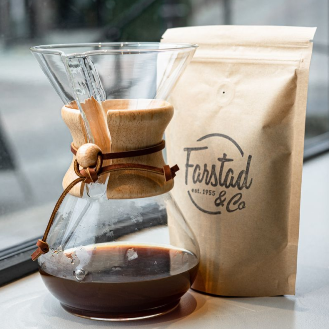
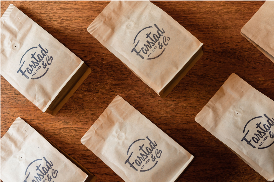
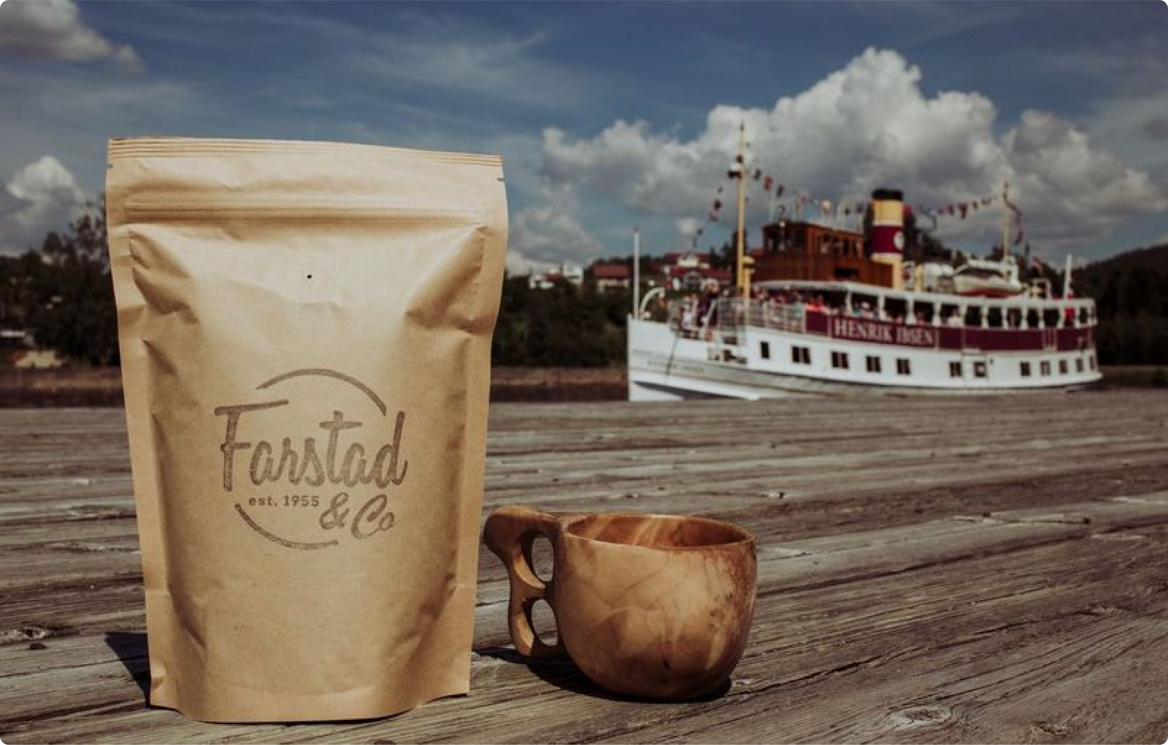
The branding for Farstad&Co. was crafted to reflect the company’s rich heritage while appealing to today’s coffee lovers. Snowball developed a timeless logo that embodies the brand’s legacy and a packaging design that combines elegance with functionality. Every element, from typography to color palette, was thoughtfully chosen to evoke a sense of quality and authenticity. This cohesive visual identity extended across all touchpoints, creating a memorable and impactful brand presence, both in-store and online.
Snowball designed a café that blends comfort, style, and tradition.
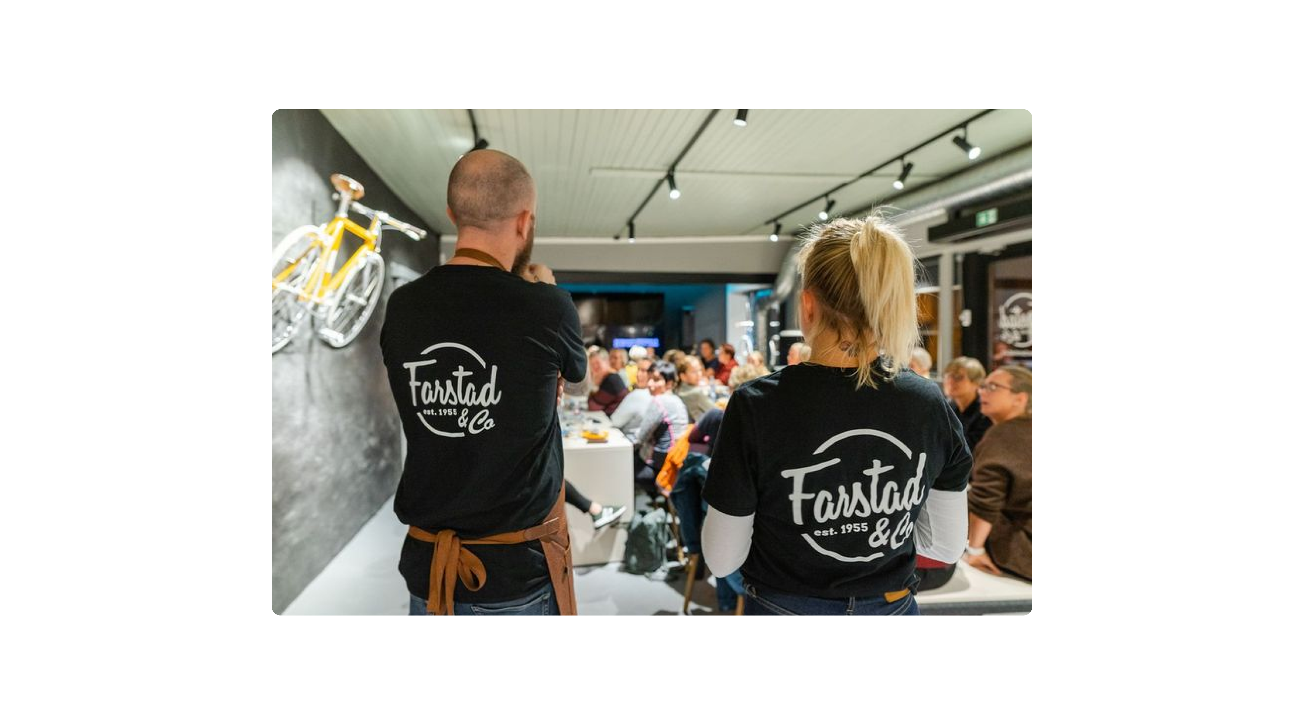
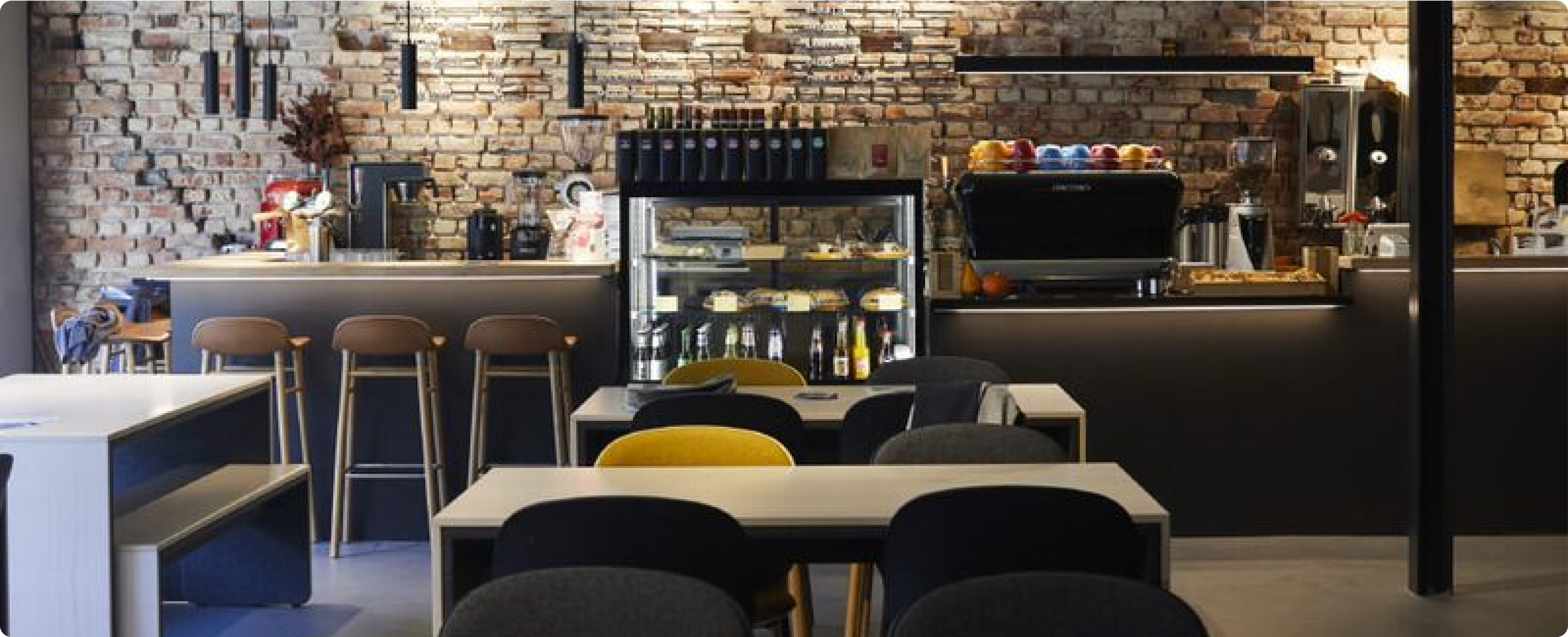
Farstad&Co.’s café was designed as a welcoming space where customers can experience the brand in a relaxed, stylish environment. Snowball focused on creating a warm atmosphere with carefully chosen furniture that reflects the brand’s blend of modern sensibility and tradition. We also integrated dedicated meeting areas, allowing the café to serve as a hub for community engagement. Every design element was selected to create an inviting setting that encourages customers to linger, connect, and enjoy the rich heritage of Farstad&Co.’s coffee.
Snowball’s design work continues to drive Farstad & Co’s growth and engagement.
Farstad&Co.’s reimagined brand and café have not only created a seamless experience for its customers but have also established a solid foundation for long-term growth. Snowball’s work ensures that every touchpoint—whether in-store or online—supports the brand’s ongoing connection with its community. The carefully crafted identity, user-friendly website, and vibrant café design have brought new customers in while retaining loyal ones, ensuring that Farstad&Co. remains a standout name in the coffee industry.


