Challenging the world of Paperworks with Origami
For Origami Paperworks our approach was to change the mindset, with a bold look. It’s about telling a story differently. A story about Paperwork Made Beautiful. Snowball created the brand platform for Origami, which established standards from brand messaging to visual design and content strategy, inspired by the brand’s healthy core. Snowball also created the name. We helped implement new strategic messaging and build a robust communication platform.
Origami - Paperwork Made Beautiful
Origami shows how a brand stands out in the world of paperwork, accounting, and legal services - with an unconventional look. We developed a product that has a strategic messaging with fresh visuals that reflects boldness and accessibility at the same time.
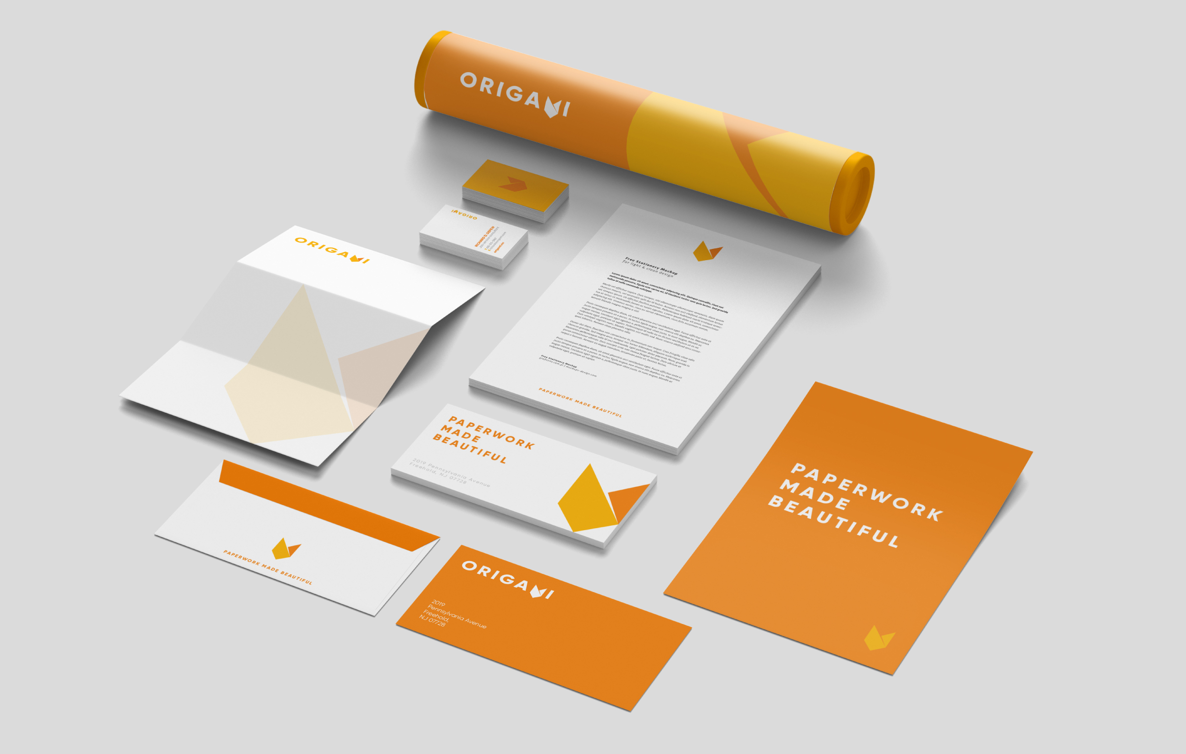
As we designed the platform, we established brand guidelines and standards that communicate how to best represent the brand across channels. The brand guidelines help them express their positioning, personality, and beliefs.

Challenging the world of company support services
Origami is a Skien-based firm that offers comprehensive services to startups - like the classic bike manufacturing company, Skiens Cykkelfabrik and growth companies like the ecommerce API service Crystallize. With the help of Snowball, the company embarked on a branding journey for its launch in the market.
Firstly it was crucial to assess and define the company’s market position in order to differentiate it from its competition. It was uncovered a focus to help their customers by providing personalized services with accessible material that avoids the complicated language often associated with the industry. This customer-centered thinking settles Origami’s position beyond the norm and what others have to offer in the business consulting landscape.

Scope of Branding and Design Work
Snowball has worked with Origami Paperworks from the brand strategy and research through service design and design.
- Brand Research
- Brand Strategy
- Service Design
- Company naming
- Visual Brand Guidelines
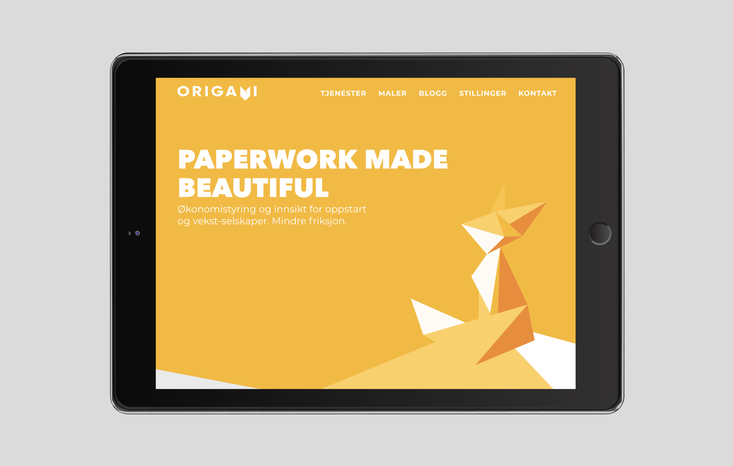
- Website
- Ongoing Brand Strategy Consulting

Strategic Intent
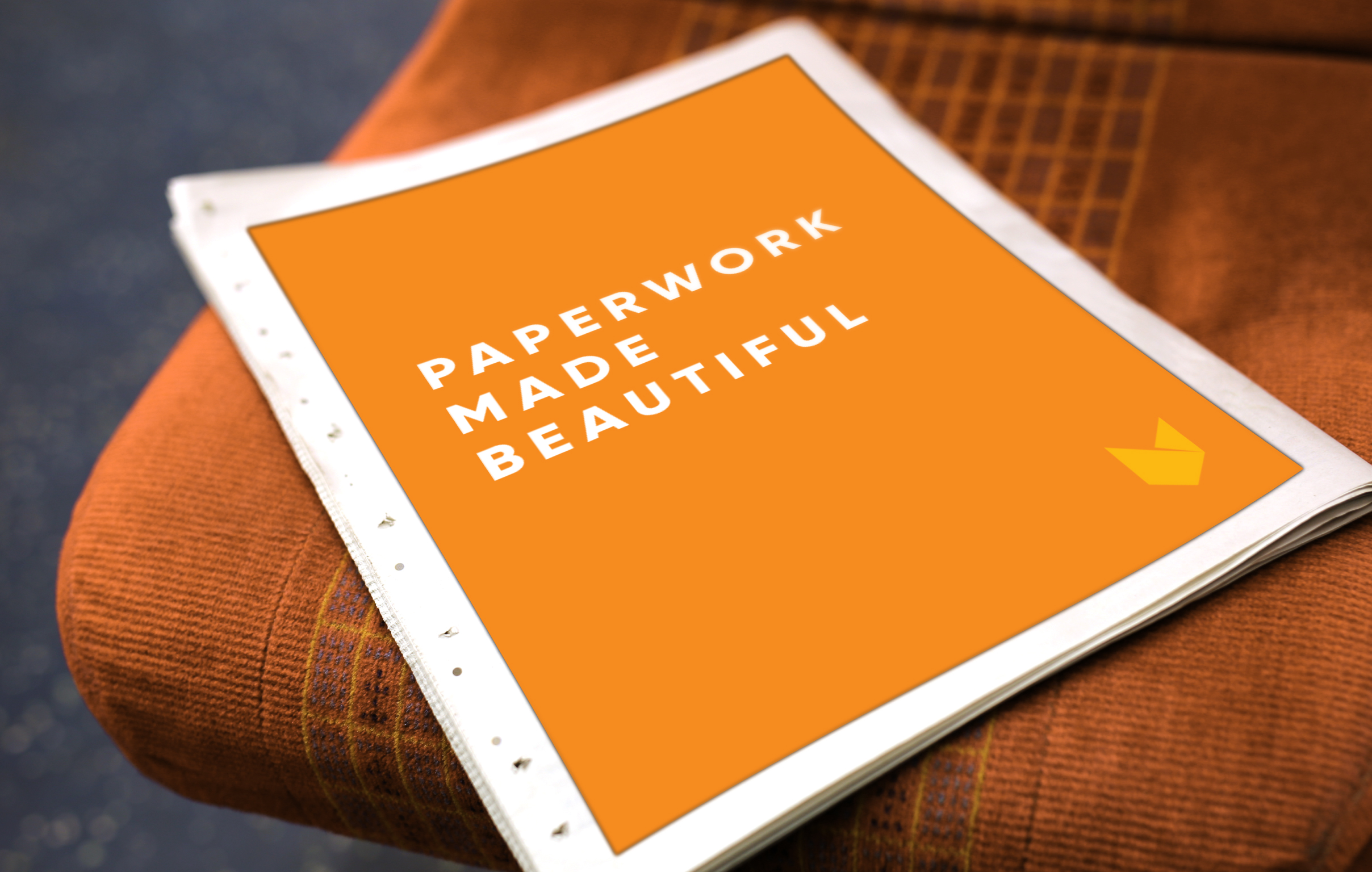
The company adopted the brand name Origami that is reinforced by the then added tagline ‘Paperwork Made Beautiful’. The tagline focus on the idea of removing the fear out of paperwork, and instead of making it something dreadful it makes something beautiful - just like what origami does to paper. It’s a customer-centric message about the company’s commitment to its clients’ best interests, portraying a sentiment that resonates well with this target audience.
Origami is all about taking the concept of paperwork to the next level. It’s through this brand positioning that Origami is able to an approach that stands out from its competition. From this, new branding and visuals elements will be designed to complement this new position.

Style & Look
Larger firms and most of the Origamis competition often lack a personal touch, using muted colors that tend to be calm and cold, as well as complex imagery. So we created a new branding that differentiates Origami from its competition, while conveying the company’s insight and accessibility.
Snowball designed a brand identity composed of bold typography, bright color treatment and an iconic mark; a design that expresses the company’s personality with a minimal elegance. It’s a simple and straightforward design language that achieves a powerful impression; the visual design, aligned with our Paperwork Made Beautiful’ message, contributed to a proactive and confident style that stands from the competition.

Results: a Happy Happy Customer
What separates Origami from its competitors is the ability to deliver an exceptional consulting experience, customizable for the customers’ needs, with deliverables that are accessible and easy to understand. Snowball had the opportunity to create a brand that reinforced the company’s position as a customer-friendly complete back office provider.
We wanted to shift the mindset from the dreadfulness often associated with “paperwork”. The tagline “Paperwork Made Beautiful” was created to capture the company’s expertise, and unique insight and perspective. It’s a brand that tells a different story in the accounting world; a position and point-of-view that differentiates Origami from the competition.
Origami’s new visual identity representing this different personality by applying bold colors playful typography, and a geometric look to create a modern minimal style. The visual design, with its proactive and encouraging style, aligned with the tagline, all combined in a playful and confident branding; with each element of the identity consistent in what we wanted to say.
The new positioning, messaging and imagery were used as the basis for the firm’s brand, which was then consistently incorporated into several marketing pieces.


