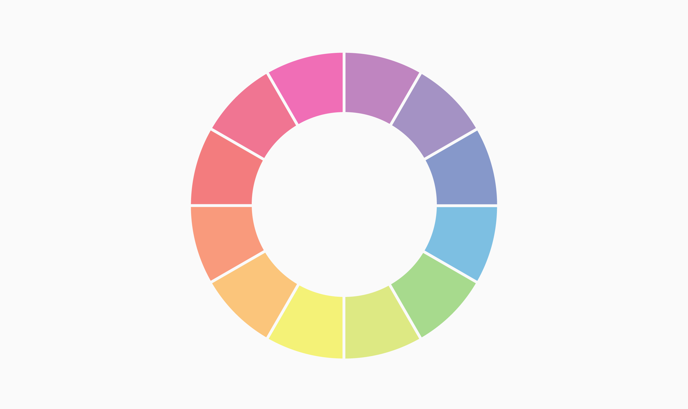
Color in Marketing and Branding
Color is considered to be one of the most complex topics in Marketing and Branding. It’s a highly nuanced topic that evokes meaningful conversations and requires some deep study.
Color is involved in every aspect of Product Design, from color palettes in brand style guides to colors systems in production. It also plays an essential role in how your brand is perceived by giving it a personality and helping with its product positioning. However, there are no rules or guidelines when choosing your brand’s colors.
The problem with the psychology of color
Humans are visual creatures, which means that we not only respond to color, but color actually has been known to have a psychological impact on our behavior. However, the perception of color and the followed impact can change from person to person. Personal preferences, experiences, environment, and cultural context contribute to the effect color can have on us. This means that the same color can be perceived in different ways by different groups of people.
Because of all the variables mentioned, the psychology of color can’t simply be universally translated to specific feelings. It’s impossible to make assumptions about which colors can evoke emotions like trust, happiness or calm on a worldwide scale.
In the end, even though color psychology has been studied for several years, there are still a lot of questions about the exact impact that color has.

Color in Branding and Marketing
When working in Product Design and Product Strategy, Color could be considered one of the most important aspects when developing your brand. Alongside its color, the visual design of a product has a huge influence on a consumer’s buying decision. In essence, color can affect how a brand is perceived as a marketing tool, much like tone of voice. Color is the visual component most recognizable about a brand, as most Top-of-Mind brands rely on this factor for their instant recognition.
So, needless to say, that Color should be part of your brand's foundation, being present in all communication forms to create consistency and recognizability. Inserting your primary and secondary brand colors in your brand style guide can help you with this process.
Picking the “right” color
While certain colors do broadly align with specific feelings and emotions, we can now understand that this is not the best approach when choosing a color for your brand and product. It’s far more important for a color to reflect your brand’s personality than trying to align with some stereotypical color association.
However, there is no cheat sheet for choosing the perfect color or color palette. It’s just about using the market and consumer research available and making an informed decision about what color or colors to use. Try to understand your consumer and user personas and consider how colors might affect their perception of your brand. To have an aesthetic response, the color needs to fit the product and your brand’s personality in the eyes of your target users.
Going against the trend
Critical thinking is essential when choosing a color for your brand and product. And as much you can use the research available to choose the “right” color, you can also make the conscious move to challenge these preconceived notions. Understanding a pattern also means that you can now break it, work outside stereotypes, and break expectations. Differentiation has always played a huge role in Branding and Marketing. By using color, you can not only stand out from the competition but make your brand easier to recognize in the market.
Recently we worked with the accounting company Origami Paperworks to create their new look. With this project, we deliberately chose to go against the norm. Instead of the soft and cold colors you normally see in the accounting and financial industry, we picked a bold and warm color position to position Origami Paperworks as a brand different from the competition.


